


Social Security Administration Website Glitch Caused Panic Among Ssi Recipients
-
Onstipes / 2 weeks
- December 30, 2025
- 0
- 9 min read
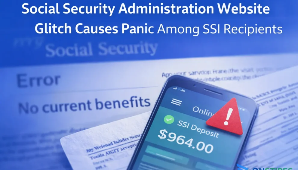
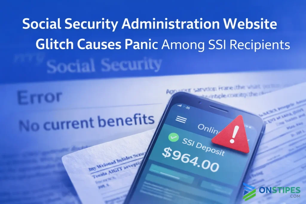
For many SSI recipients, logging into an online account is a routine check, similar to checking a game server status or a cloud dashboard. When the Social Security Administration website suddenly displayed messages suggesting benefits were not being paid, that routine action quickly turned into widespread concern. The issue was not a rumor spreading on social media. It appeared directly inside official user accounts.
What made the situation more alarming was the lack of context. Users saw missing payment histories or warning-style messages without clear explanations. For people who rely on SSI for essential expenses, even a temporary error message can feel like an immediate financial threat, especially when no real-time clarification is visible.
This article examines what actually happened, why the interface caused panic, and how to evaluate similar system issues more calmly in the future. The goal is not to dramatize the glitch, but to explain it clearly using real-world logic and a tech-aware perspective so readers understand both the system failure and the human reaction behind it.
What Actually Happened on the Social Security Website?
The short answer is that a display-level error caused incorrect or incomplete information to appear inside some user accounts. SSI recipients logging in saw missing payment histories or messages that implied benefits were not being issued. Importantly, this was not a confirmed backend payment failure. The issue came from how account data was shown to users, not from benefits being stopped or revoked.
From a systems perspective, this type of problem is common during maintenance, updates, or temporary synchronization failures between databases. When the front-end interface cannot properly fetch or render data, it may default to warning-style messages or blank fields. For users who depend on consistent payments, that absence of information can easily be interpreted as a serious problem rather than a technical fault.
A common mistake is assuming that what appears on a dashboard reflects real-time financial action. In reality, many government systems update in batches and rely on multiple internal checks before payments are affected. The glitch exposed a communication gap where the system showed alarming signals without explaining that the data itself might be temporarily unavailable.
Why SSI Recipients Interpreted the Error as a Payment Cut
The immediate interpretation was driven by how the message was framed, not by what actually happened. When a system removes payment history or displays language suggesting there are no current benefits, most users logically assume action has already been taken. There was no visible distinction between a data-loading issue and an actual eligibility or payment decision.
For SSI recipients, this reaction is amplified by lived experience. Benefits are often reviewed, paused, or adjusted in real life, so an unexplained system message fits an existing mental model of risk. Unlike a game server outage or an app bug, financial systems carry real consequences, making users far less willing to wait for clarification.
A key mistake here is trusting the absence of data as confirmation of change. In digital systems, missing information often signals a technical failure rather than a completed decision. Without a clear banner or status notice explaining the error, users filled in the gaps themselves and assumed the worst.
Was This a Real Benefits Issue or a Display-Level Glitch?
It was a display-level glitch, not a confirmed interruption of SSI payments. There is no evidence that benefits were paused, canceled, or recalculated because of what appeared on the website. Payment processing operates on separate backend systems that do not change simply because an account page fails to load or shows incomplete data.
This distinction matters. In most large platforms, whether government or private, the user interface is the final layer, not the source of truth. If that layer fails to sync properly, it can show outdated or empty fields while core processes continue normally. Bank deposits, payment authorizations, and eligibility checks usually run on schedules independent of the web portal.
A common error is assuming a dashboard reflects live financial action. In reality, dashboards can lag, cache data, or temporarily break during updates. Treating an interface message as a final decision without external confirmation turns a technical hiccup into unnecessary stress.
How Online Account Systems Can Trigger Panic During Errors
The core issue was not just the glitch itself, but how users interpret system feedback under uncertainty. When an online account shows warnings, missing data, or unexpected status changes, people often assume the system is reporting a completed action. That assumption is reasonable in many digital environments, especially ones that usually work quietly in the background.
For tech-savvy users, this is similar to seeing a game account suddenly show no active subscription after a sync error. The difference is the stakes involved. With SSI, the perceived loss is not entertainment access, but rent, food, or medical stability. That context turns a neutral technical failure into an emotional trigger almost instantly.
A common mistake is equating interface authority with system authority. Front-end messages feel official, but they are often the least reliable layer during outages. Without clear error labeling or maintenance notices, users default to interpreting silence or blank fields as negative outcomes rather than temporary system behavior.
What the Social Security Administration Confirmed After the Incident
The direct confirmation was that SSI payments were not stopped or suspended as a result of the website issue. The problem was acknowledged as a technical error affecting how information was displayed to users, not how benefits were processed. In practical terms, the system that shows account data malfunctioned while the system that sends payments continued operating normally.
This clarification matters because it highlights how government platforms are structured. Payment execution, eligibility determinations, and public-facing dashboards are not the same systems. When one fails, the others do not automatically fail with it. The confusion arose because users saw incomplete data without any explanation attached.
A practical lesson here is not to treat an unexplained on-screen message as a final decision. Official confirmation, payment deposits, and written notices carry far more weight than a single account screen during a known technical issue.
Were SSI Payments Ever Actually Stopped or Delayed?
No. There was no verified interruption to Supplemental Security Income payments connected to the website issue. Deposits continued to follow their normal schedule, and recipients who checked their bank accounts generally saw funds arrive as expected. The panic was driven by what users saw online, not by what happened financially.
This disconnect highlights an important reality of large payment systems. Funds are released through established processing pipelines that do not depend on real-time website displays. A portal error can remove or hide payment history without affecting the underlying transaction itself.
A common mistake is reacting immediately to an on-screen message without verifying external signals. When payments matter, the safest approach is to confirm deposits directly and wait for official clarification before assuming a system message reflects a real change.
Common User Mistakes When Relying on Government Dashboards
The most frequent mistake is treating a dashboard as a real-time decision engine rather than a reporting layer. Many users assume that if a status changes on screen, the underlying action has already occurred. In reality, dashboards often lag behind actual processes or fail temporarily during updates, maintenance, or traffic spikes.
Another issue is checking only one source. When users rely solely on a single website during a known technical issue, they miss more reliable confirmation methods such as bank deposits or official notices. This creates urgency based on incomplete information rather than verified outcomes.
A third mistake is acting before context appears. Immediately calling support lines or assuming eligibility problems can increase stress without adding clarity. Waiting for confirmation, cross-checking information, and recognizing that display errors are common leads to better decisions.
How to Verify SSI Status Without Relying on a Single Website
The most reliable way to confirm SSI status is to check outcomes rather than interfaces. Bank deposits and direct deposit records show what actually happened, regardless of what a website displays. If funds arrive on schedule, that confirms payment processing more clearly than any dashboard message during a system issue.
Another practical step is to wait for official notices delivered through mail or verified communication channels. Eligibility changes or payment interruptions are rarely communicated only through a brief on-screen message. They are usually accompanied by written explanations outlining timing, reasons, and next steps.
A common mistake is treating immediacy as accuracy. When a portal behaves unexpectedly, stepping back, cross-checking financial records, and allowing time for clarification leads to better decisions than reacting to a single unverified screen.
What This Glitch Reveals About Legacy Systems and Modern UX
At a system level, the incident highlights the tension between legacy infrastructure and modern user expectations. Many government platforms were built in stages over decades, with newer interfaces layered on top of older processing systems. When those layers fail to communicate cleanly, users see confusing or incomplete information even if core functions are still running correctly.
From a user-experience perspective, the problem was not complexity but ambiguity. Modern digital products train users to trust dashboards as authoritative. When a system does not clearly label an error as temporary or technical, users assume intent rather than malfunction, especially when the platform represents financial or legal authority.
A key takeaway is that clarity matters more than polish. Clear error messaging, status indicators, and context can prevent panic even when systems fail.
How Future System Errors Can Be Interpreted More Safely
The safest approach is to separate system visibility from system action. When a portal shows missing data or vague warnings, treat it as a signal to verify, not a verdict. Financial systems rarely execute major changes without multiple confirmations, written notices, and time buffers.
Another practical habit is delaying reaction until context appears. Large platforms often acknowledge issues within hours rather than minutes. Repeated refreshing or assuming the worst increases stress without improving accuracy. For tech-literate users, this is similar to waiting for official status pages during outages instead of trusting in-app errors alone.
A common mistake is assuming urgency equals accuracy. In reality, measured verification through deposit checks, official updates, and multiple confirmation channels leads to clearer and calmer decisions when systems misbehave.